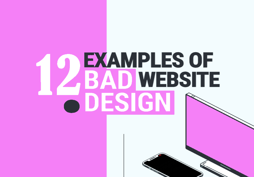
The 12 Bad Website Designs You Will See till Date
- July 8, 2021
Entrepreneurs
,Website CMS
,Websites
It is said that you should never judge a book by its cover, and while that is true, it’s also true that viewers will always judge a brand or business with their website. Over the years, I have seen some really bad website designs that are nothing less than appalling. Some of these were hard to look at, while others – well, I just had to close them immediately.
Bad website designs don’t always mean horrible images or sharp colors. Sometimes, the element placement or a poor UX design is enough for users to abandon the website within a minute.
Here’s a list of the twelve worst websites you’ll ever see, and trust me, these designs will surprise and make you question, “how can they be comfortable with this design?”
Let’s get started.
The 12 Bad Website Designs You Can’t Look At Again!
1. Yale University School of Art

The first website name on the list will shock you, but it’s Yale University School of Art.
Now, when you see the website belonging to Yale School of Art, you automatically assume the website will be the epitome of what the school stands for. Spoiler alert: it’s not.
My first impression of the website was, “am I even looking at the right website here? Is this really a Yale website?” Well, sadly, yes, it is.
The website is programmed using Ruby on Rails and overlooked by the faculty and students. When you look at it, you get confused about choosing the worst element present on the website.
Here’s what’s wrong with the design:
- The color combination is horrible to look at.
- The background image is too tiled to look appealing.
- The font choice is inexcusable.
- The way they’ve placed the text and elements is just off-putting.
2. Arngren

Need I say anything once you look at the website? I don’t think so.
When I came across the Arngren website, I was mortified, to say the least. When users look at a website, they want to understand what it’s about the minute they look at it. However, the Arngren website doesn’t serve the purpose.
I don’t think anyone can tell what the website represents unless they dig deeper. With that said, if you try to browse the website further, it’ll be a mistake because the navigation is so horrific that the poorly designed website will take ages to load a page.
Here’s what’s wrong with the design:
- There is unwanted, annoying to look at the clutter on the homepage.
- There are too many different text sizes.
- The colors make the text unreadable.
- The grid alignment is out, which is painful to look at.
3. Craigslist

Another website on this list of poorly designed websites is Craigslist.
The choice might shock you because the website has brought so much ease to the average American. Most might not agree with my choice, but I think it’s justified.
The Craigslist website might get the job done, but its popularity doesn’t justify the design they’ve chosen. Websites are supposed to be attractive enough to keep people on the site – and a first-time user would probably leave unless it comes highly recommended.
Here’s what’s wrong with the design:
- It’s one of the bad website designs because it’s too plain and simple.
- Excessive whitespace.
- The simplicity is intended.
4. Suzanne Collins Books

Who doesn’t love Suzanne Collins Books? Of course, she’s loved because she gave us the Hunger Games trilogy, books, and movies. With how she wrote the books and took us on a journey as if we were part of the book, you’d expect the website to be just as amazing; sadly, it’s not.
When you first look at it, the website doesn’t look bad. It uses a good color palette, has easy navigation, etc. But if you look closely, you’ll notice everything wrong with the website.
Here’s what makes it a bad website design:
- The website is designed for 200% zoom.
- There is too much whitespace which makes it dull and boring.
- The website is rarely updated, so it has too many dead links.
- It has unnecessary documents to download that could just be another page.
5. Typesetdesign

If you haven’t guessed it already, the reason Typesetdesign is on this list is because it lacks color and oomph, which makes it a bad website design. The lack of color is the main reason why the users will bounce off the website. It also makes it difficult for users to understand the navigation of the website.
Can you understand how to go to the next page? Or what to do on the website once you’ve landed on the website?
If you have the right balance of colors on your homepage, it can help your users understand what the website is offering.
Here’s what’s wrong with the design:
- There is a lack of color which takes away the website’s appeal.
- The combination of the background and text color makes the text unreadable.
- Users can’t really tell what Typesetdesign is offering because of the bad website design.
- Users would rather use other websites.
- The white text and difference in font size make it unable to read.
- The lack of elements will make it difficult for users to understand what the website is about.
6. Petersbuss

Look at that website design; what do you think it represents? Are they offering a cruise? Do they offer spa treatments? What is travel insurance for?
For someone who looks for the Petersbuss website will be sorely confused about what they want to sell. Who wouldn’t be? It’s a bad website design.
Here’s what’s wrong with the design:
- The color scheme is not pleasing to the eye.
- They have limited content that doesn’t exactly say what they’re offering.
- Too many hypertext links.
7. Penny Juice

Penny Juice is the epitome of bad website designs because there are too many things wrong with the website. First off, can you even tell what they’re trying to sell through the website? Is it fruit juice, and if it is, why is the website called penny juice?
Needless to say, they didn’t put much thought into their design which and added every element that came to their mind.
Here’s what’s wrong with the design:
- The color scheme is off-putting because it has too many colors, even for a children’s website.
- The banner text is unclear.
- The layout lacks proper navigation.
8. Great Dreams

When you read the name “great dreams,” your mind goes to a website that talks about dreams, aspirations, and showcases success stories – but sadly, you’re wrong.
The great dreams website is a great disappointment because the website design is everything you don’t want it to be. The website is an example of what bad websites represent – laziness and lack of thought process.
Here’s what’s wrong with the design:
- The color scheme is very disproportionate.
- The website message is unclear.
- The text color and background are not in sync.
- The images lack uniformity in size and quality.
9. Pacific Northwest X-ray Inc.

The Pacific Northwest website explains well what they offer, but can you read it easily? I bet you can’t. The website is a single page, and you’d think that they would put more thought into the website, but that’s not the case here.
They’ve failed to check all the boxes that make up a good website. It’s not even half-decent.
Here’s what’s wrong with the design:
- There are a plethora of colors which is anything but appealing.
- The background and text color combinations are abysmal.
- There are too many hyperlink words that are annoying to look at.
- It lacks a banner that summarizes what the website is offering.
- They’ve forgotten to eliminate grammatical errors from the text.
10. Lingscars

The Ling’s Cars website honestly looks like a website someone made just for fun. If anything, the website looks like it was created as a joke for Ling’s Cars – but the fact is, it’s far from a joke. It’s the actual website for the car rental service.
Mrs. Ling is very famous; however, her website design shadows her success and can be the reason people don’t take her services seriously.
Here’s what’s wrong with the design:
- There are too many gifs on the website, which makes it annoying for users.
- There are too many colors.
- The website’s brightness makes the text hard to read.
- The images, gifs, and colorful text make the website hard to understand even though it has clean navigation.
11. Budgets are sexy

“Budgets are sexy,” and they might be, but this website layout is certainly not. The website might look okay at first glance, but the more you look at it, the more flaws you see. Albeit, the flaws are minute, but they’re still worth mentioning.
Here’s what’s wrong with the design:
- The color combination is too monotonous and could use one or two more colors.
- The buttons don’t look like buttons due to the absence of background shadows.
- The website lacks intuitiveness.
- It has no responsive design, which means mobile users can forget about using the website. A responsive design is a necessity for every brand in this digital age.
12. Historian of the future

The disturbed harmony between the background and text color, the content placement, and the unavoidable navigation – what isn’t wrong with the website? Like the Argren and Penny Juice, the Historian of the future website is another example you can’t stand to look at.
The bad website designs really make you wonder, how can a website go this wrong? The answer is simple – lack of research.
If brands research before they create a web design, they would better understand what the website should look like.
Here’s what’s wrong with the design:
- The background has too much going on.
- They used too many colors for the text.
- The background image would’ve looked better as a banner.
- A banner would’ve better explained what the website is about.
In Conclusion
Building a website requires money, time, and patience. It’s only worth launching a website if you do justice to it. So, if you’re going to launch a website, make sure it serves its purpose and showcases what it’s intended for.
Try to eliminate elements that make up bad website designs. If your website is hard to look at and read, users will turn away and take their business elsewhere. Look at the websites, understand their problem, and then cross-check with your website to eliminate any such mistakes.
Remember, too much of anything is harmful, so focus on proportion to get it right the first time. You might have noticed, these websites are also outdated, for that go through the latest trends to make your website better – there is always room for improvement!
Shameen
I'm an enthusiastic content writer who loves facing challenges and knocking them out of the park.